01
Brand
Dots Energy is a Belgian energy supplier. We pass real market prices through to households, show people what their energy is actually doing, and steer the assets in their homes so they get more out of it.
What we do
Smart energy management and delivery for people who pay attention to their energy bill. Three things make that concrete: dynamic contracts that follow the market instead of hiding it, metering insights that are legible to a non-expert, and active steering of batteries, EV chargers and heat pumps across energy and reserve markets.
We are part of the BK Investment Group, alongside Smart-E-Grid, Pips Energy and Opteco — each a separate brand with its own guidelines. Our market is Belgium.
Slimme inzichten,
duurzame besparingen
Use the Dutch. Do not translate it, do not shorten it, and do not set it in a typeface other than Noka. Smart insights, sustainable savings exists only to explain the meaning to people who do not read Dutch.
02
Logo
Three parts: the purple circle with four notches, “Dots” in bold, and “energy” underneath in a lighter weight. Use it as supplied. Never rebuild it.
Versions
The mark on its own

Clear space
Keep clear space on all four sides equal to the height of the D in “Dots”. Nothing enters that area: no text, no image edge, no other logo, no page margin.
Minimum size
What not to do
Each of these is the real logo, actually altered. They are here so the mistake is recognisable rather than described.
Stretched or squashed. Scale proportionally.
Recoloured. The purple is fixed.
Rotated or tilted at any angle.
Shadows, glows or any other effect.
Framed, boxed or outlined.
On a busy background without contrast.
Under 120 px, where the notches close up.
Crowding the edge or ignoring clear space.
Which file to use
| Where | Format | Why |
|---|---|---|
| Web and screen | SVG | Sharp at any size. Always first choice. |
| Email signatures | PNG | Outlook renders mail through Word, which has no SVG support. |
| Print and production | EPS, PDF | CMYK, vector, what a printer expects. |
| Social profiles | PNG | Pre-cropped to each platform's frame. |
| Signage and photography | PNG, JPG | The 3D matte lockup. Never use it in an interface. |
Black and white versions
Single-colour black and single-colour white versions exist for print. Use them only when a printer or partner explicitly asks for one colour — not as a stylistic choice.
03
Colour
Purple carries the brand, green means progress and sustainability, pink is for accent and emphasis. The system follows Material Design 3 colour roles, so every colour has a defined partner to sit on. Select any bar to copy its hex.
Light mode
Primary — Purple
Primary actions, key interface elements, brand presence.
Secondary — Green
Secondary actions, success states, sustainability messaging.
Tertiary — Pink
Accents, call-to-action highlights, promotional content.
Surfaces
Page background, cards, dividers, borders, secondary text.
Dark mode
Primary — Light purple
Secondary — Light green
Tertiary — Light pink
Surfaces
Gradients
Four defined gradients, all at 135 degrees. Use them for hero areas and brand moments, not as decoration on ordinary interface elements.
Print — CMYK
| Colour | C | M | Y | K |
|---|---|---|---|---|
| Purple | 70 | 66 | 0 | 0 |
| Green | 60 | 0 | 85 | 0 |
| Light green | 26 | 0 | 40 | 0 |
| Pink | 12 | 68 | 0 | 0 |
| Light pink | 0 | 24 | 2 | 0 |
| Dark background | 85 | 70 | 48 | 60 |
Contrast
The role pairs above are built to meet WCAG 2.1 AA: 4.5:1 for normal text, 3:1 for large text and interface components. Keep the pairs together — “on primary” belongs on “primary”. Green and pink are bright: never set small text in either on a white background.
04
Typography
Two typefaces, both licensed from Adobe Fonts. Noka for anything that carries weight, Dorival UI for everything people read. Never introduce a third.
Noka
ABCDEFGHIJKLMNOPQRSTUVWXYZ abcdefghijklmnopqrstuvwxyz 0123456789
Dorival UI
ABCDEFGHIJKLMNOPQRSTUVWXYZ abcdefghijklmnopqrstuvwxyz 0123456789
Licensing
Both typefaces are licensed from Adobe Fonts: Noka and Dorival UI. Our licence does not extend to you, and we cannot pass the font files on, so they are not included in any download on this site. If you are producing work for us, use your own Adobe Fonts subscription or a licensed desktop copy from the foundry.
If you cannot license them for a particular job, set the work in the fallback below and tell us — a consistent fallback is better than a substitute face chosen ad hoc.
Fallback stack
Poppins, then -apple-system, Segoe UI, Roboto, Helvetica, Arial, sans-serif. Poppins is the closest free stand-in and is what our email templates use, since mail clients cannot load webfonts at all.
Type scale
The Material Design 3 scale, shown here at actual size. Scroll a row sideways on a narrow screen.
Do
- Use Noka for headlines and display text
- Use Dorival UI for body copy and interface elements
- Build hierarchy with size and weight, not with colour
- Keep line height at 1.4 or more
- Use sentence case for interface text
Don't
- Add a third typeface
- Use decorative or display faces from elsewhere
- Set body text below 14 px
- Tighten line height below 1.4
- Use more weights than the page needs
05
Brand elements
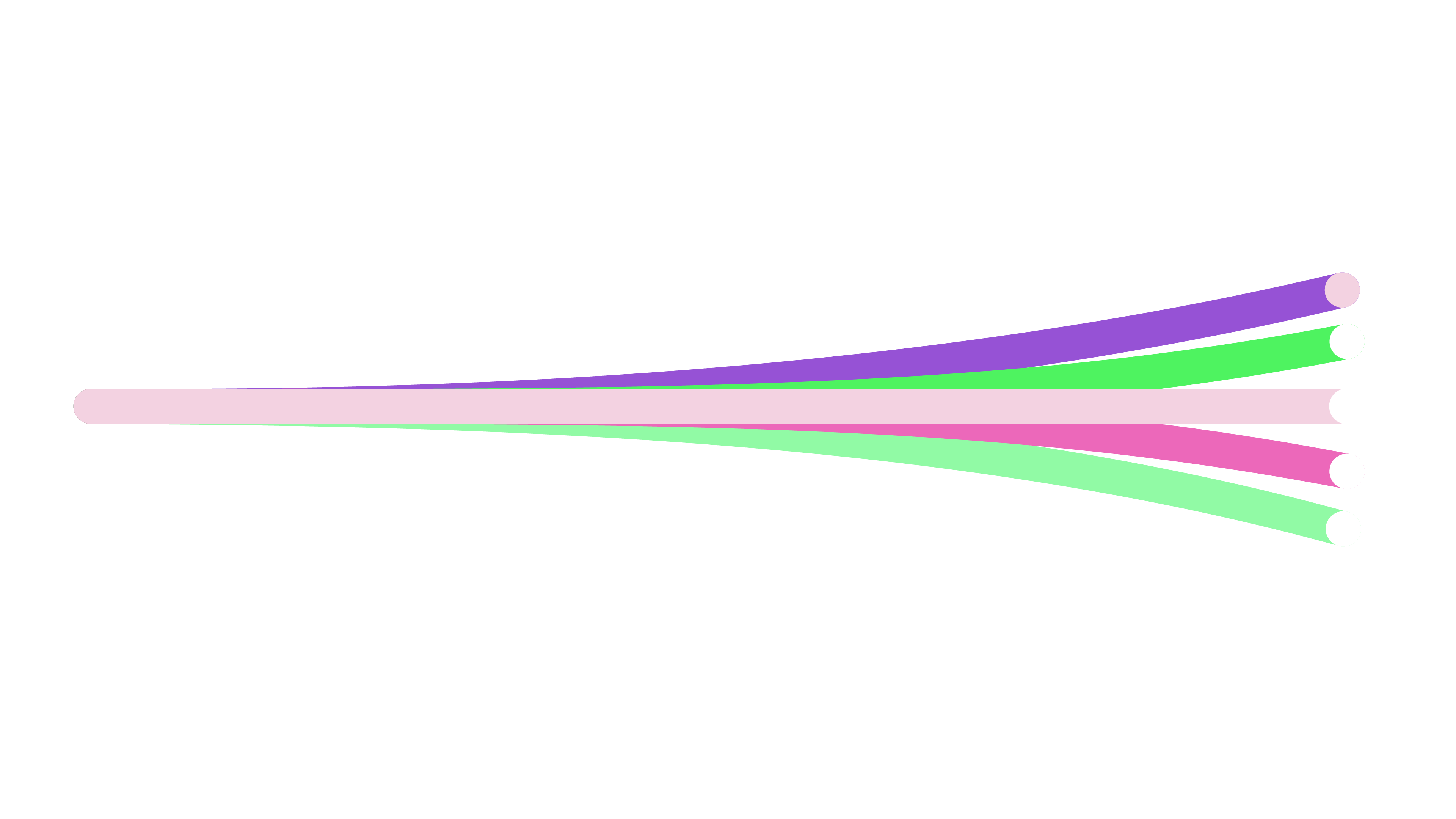
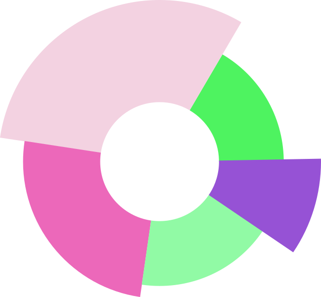
A set of graphic elements built from chart geometry: rounded-cap bars, donuts, arcs, trend lines that end in a dot. They come from what we do — energy data, made friendly. Use them as supporting composition, never over the logo or behind text.

Using them
These are compositions on a 16:9 frame, so they crop well as a background band or a corner accent. Several of them run off the edge of that frame on purpose — the previews above show each file exactly as it is drawn, bleed included. Keep them in brand colours, keep the rounded caps, and keep text off them. The editable Illustrator source is in the downloads if you need to recompose.
06
Downloads
Every published asset, with a permanent address. These URLs do not change, so you can reference them directly from a document, a template or a signature.
Referencing an asset directly
If you need a logo at a fixed URL — in an email signature, a partner's site, a document template — use the address rather than a copy of the file. That way a corrected asset reaches every use at once.
https://brand.dotsenergy.be/assets/logos/dots-logo-light.svg
Fonts are not here
Noka and Dorival UI are licensed from Adobe Fonts. We cannot redistribute the font files, so they are not in any download on this site. You need your own Adobe Fonts licence, or a licensed desktop copy from the foundry.
07
Legal & trademark
These guidelines and the assets on this site are published so that people working with us can represent the brand correctly. They are not a grant of ownership, and publishing them here is not permission to use them freely.
Ownership
The Dots Energy name, the Dots Energy logo, the mark, the wordmark, the tagline “Slimme inzichten, duurzame besparingen”, and the graphic elements shown on this site are trademarks and protected works of Dots Energy BV, a company registered in Belgium under enterprise number BE 0799.161.323, with its registered office at Senator A. Jeurissenlaan 1020, 3520 Zonhoven, Belgium. All rights are reserved. Nothing on this site transfers any right, title or interest in them.
Permitted use
If we have given you written permission — as a partner, supplier, installer, reseller, or in an agreed press or editorial context — you may use the assets as supplied, within the rules in these guidelines, and only for the purpose we agreed. Keep the marks unmodified, respect the clear space and minimum sizes, and use the file formats as described.
Press and media may use the logo to illustrate coverage of Dots Energy without asking first, provided the coverage is accurate and the marks are unmodified.
Not permitted
- Using our marks as, or as part of, your own logo, trademark, company name, product name, domain name, social media handle or app name
- Altering the marks — colours, proportions, typography, orientation, added effects — in any way
- Using the marks in a way that suggests we endorse, sponsor, certify or are affiliated with your product, service, organisation or opinion, where that is not the case
- Using the marks on merchandise, packaging, signage or advertising without written permission
- Using the marks in a misleading way, or alongside content that is unlawful, deceptive, or damaging to our reputation
- Registering or claiming any right in our marks, or anything confusingly similar to them, anywhere in the world
- Using the marks in a way that implies you are an official Dots Energy channel, including in support, sales or billing communications to our customers
Third-party rights
Typefaces. Noka and Dorival UI are licensed from Adobe Fonts. They are not ours to pass on, they are not included in any download on this site, and you need your own licence to use them. Naming them in these guidelines is not a sublicence.
Sister brands. Smart-E-Grid, Pips Energy, Opteco and BK Investment Group are separate brands with their own owners and their own guidelines. Permission covering the Dots Energy brand does not extend to them.
No warranty, and changes
The assets and guidance on this site are provided as they are, without warranty of any kind. We may change these guidelines, replace or withdraw assets, and withdraw permission to use our marks, at any time and without notice. When we do, stop the withdrawn use within a reasonable period. Using an asset from this site does not create a contract, partnership or agency relationship between us.
Nothing here limits rights you have under applicable mandatory law, including the right to refer to our trademarks descriptively where the law allows it.
Governing law
These guidelines are governed by Belgian law. Disputes fall to the courts competent for the registered office of Dots Energy BV, without prejudice to any mandatory rule that assigns them elsewhere.
Asking permission, or reporting misuse
Write to info@dotsenergy.be. Tell us who you are, what you want to use, where it will appear, and for how long. If you have seen our brand used in a way that looks wrong, the same address is the right place to report it.
Unsure whether your use is covered?
Ask before you publish. A short email is quicker than a correction, and we would rather help you get it right than ask you to take something down.